

Forex Charts for Effective Analysis
Forex trading Chapter 5
Unlock the secrets of the forex market by learning to use Forex charts effectively. With a vertical axis that captures price fluctuations, you can scrutinize candlestick patterns to anticipate market movements. By examining various time frames, you grasp the pulse of trades, from minute-by-minute volatility to broader shifts. Recognize the turning point in EUR/USD dynamics, and gain the insight needed to make informed trading decisions. This knowledge is not just an advantage; it’s a necessity for anyone looking to succeed in forex trading.
Forex charts – why do you need them?
Charts are essential for your technical analysis. Besides, what is analysis without a chart? You’ll need your forex charts when you’re applying analysis, which we will talk about in this chapter.
Gambling is not like forex trading for beginners.
Sure, there are risks involve. But the difference between the two is that gambling is relying on luck.
But with forex trading, you need to have analysis to know when to make a move. This is where forex charts come in.
These are the necessary tools you need. Whatever trading strategy or method you’re using, viewing a chart and applying technical analysis are very convenient.
It’s amazing how a chart with associated patterns can bring a wealth of information in the simplest terms.
Let’s start.
Leverage Forex Charts for Enhanced Technical Analysis
Utilize our real-time trading charts to gain an in-depth view of the price dynamics of currencies, stocks, and commodities. These charts are essential for performing robust technical analysis. Spot patterns, discern trends, and make informed decisions in response to market movements by selecting your preferred asset and incorporating tools like moving averages and Bollinger Bands among other indicators, to refine your trading approach.
To delve deeper into technical analysis and learn how to effectively apply our complimentary trading charts to forex and other asset trades, review our top 3 technical analysis charts for savvy trading insights.
Line Charts
A line chart shows you a good snapshot of market direction. It draws a line from one closing price to the next closing price.
If you connect the prices together, you’ll see the general price movement of a pair over a period of time.
Here’s an example of line chart for EUR/USD:

Bar Charts
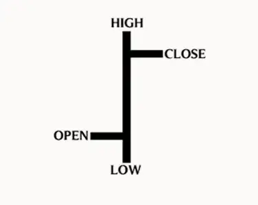
A bar chart offers a more intricate view than a line chart. It displays the open and close prices, along with the peak highs and deep lows of a trading session.
The uppermost part of the vertical bar represents the top price achieved, while the bar’s lowest point reflects the minimum price.
The full length of the vertical bar captures the complete trading range for the currency pair. Notice the small ticks or hashes on either side of the bar: the one on the left shows the opening price for the period, and the one on the right shows the closing price.
Here’s an example of EUR/USD bar chart:

Let’s take a look of a close up version:
Open – this is the opening price.
High – this indicates the highest price of the time period.
Low – this indicates the lowest price of the time period.
Close – this is the closing price.
Candlestick Forex Charts
Candlestick charts are more fun and useful to look at than the other types of forex charts. This type of chart is similar to the bar chart but in a graphical format.
Like a bar chart, a candlestick bar indicates the high-to-low range with a vertical line.
The vertical line above the body is called the upper shadow, while the bottom is called the lower shadow.
The body in the middle indicates the range between the opening and closing prices.
If the body in the middle is filled with a darker color, then the currency pair closed lower than it opened.
On the other hand, if the body in the middle is white or filled with a lighter color, then the closing price is higher than the opening price.
Here’s an example of a EUR/USD candlestick chart:

And here’s a close up view of the candlesticks:
You might be wondering why candlesticks have different bodies and length.
Long white candlesticks show strong buying pressure. See, the longer the white candlestick, the further the close is above the open. That means, buyers were aggressive and made prices increasing significantly from open to close.

Long black candlesticks show strong selling pressure. The longer the black candlestick, the further the close is below the open. That means, sellers were aggressive and sent prices falling a great deal from the open.
Do you need all these charts? In fact, you’ll find several of them in later chapters. They are required for your analysis, which we will talk about in the next chapter.
Forex chart patterns – In Conclusion
Forex charts serve as critical tools for traders navigating the foreign exchange market. These patterns offer crucial insights into price movements, aiding traders in making savvy decisions. Traders who master the art of recognizing and understanding various chart patterns can sharpen their trading strategies and secure a competitive advantage.
FAQs about Forex charts
What is a Forex chart?
A Forex chart is a graphical representation showing the price movement of a currency pair over a specific timeframe. It reflects the trade activity within a certain trading interval, which can range from as short as 10 minutes to as long as a week.
Which type of chart is the best to use in Forex trading?
Candlestick charts are widely regarded as superior to line, OHLC, or area charts because they provide a wealth of information, making them indispensable for evaluating price movement across different time frames. Among the numerous candlestick formations, certain patterns are exceptionally valuable for forex trading.
How does one interpret Forex charts?
In a HLOC (High, Low, Open, Close) or bar chart, the open price is indicated by a horizontal line to the left of a vertical line, while the close price is marked by a horizontal line to the right. The vertical line’s highest point denotes the high price, and its lowest point indicates the low price.
What are the essential chart patterns in Forex?
Essential Forex chart patterns include:
- Candlestick patterns
- Double tops and double bottoms
- Head and shoulders
- Inverse head and shoulders
- Rising and falling wedges
- Hammer and inverted hammer
- Butterfly
- Engulfing patterns
Which charts are best suited for day trading?
Day traders often prefer 15-minute charts for executing trades. They might also use 60-minute charts to determine the main trend and five-minute charts—or even tick charts—to understand the short-term trend.
Do forex chart patterns work?
Forex chart patterns are essential for traders in the foreign exchange market. These patterns provide valuable insights into price movements and help traders make informed decisions. By understanding and identifying different chart patterns, traders can gain an edge in their trading strategies.
Do forex patterns repeat?
Forex patterns emerge often and with a regular rhythm throughout the trading day, across all currency pairs. For active Forex traders who understand how to identify and execute trades based on these patterns, they offer more secure trading prospects.